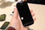
T-Mobile myTouch hands-on

That front-facing camera, optical trackpad and Genius button are all in plain sight, but we’re afraid we didn’t get to give them a try — the screen on this T-Mobile myTouch is pitch black because it’s just a hardware prototype. That didn’t keep us from snapping plenty of pictures when we spotted the Froyo-filled HSPA+ handset at the carrier’s booth, though — including a few of the phone side-by-side with its predecessor, the myTouch Slide . First, you’d probably like to hear about the hardware on display, so here’s the executive summary: the device feels fairly solid, it’s got a neat two-tone design with a fancy metal battery cover, and there’s a nice big shutter button. The myTouch also sports a set of three copper contacts on the side almost certainly destined for a landscape dock, though nearby T-Mobile representatives quickly disavowed knowledge of any such product. They did confirm we’ll see the phone by the holidays, though, so we won’t have long to wait. Gallery: T-Mobile myTouch prototype, hands-on Gallery: T-Mobile myTouch vs. myTouch Slide T-Mobile myTouch hands-on originally appeared on Engadget on Thu, 07 Oct 2010 12:25:00 EDT. Please see our terms for use of feeds . Permalink


Posted by
on October 7, 2010. Filed under
News,
Tech.
You can follow any responses to this entry through the
RSS 2.0.
You can leave a response or trackback to this entry

