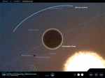
App review: Planetary for iPad

The iPad’s music player hasn’t changed much since its debut, and unlike its desktop counterpart, it also lacks a built-in music visualizer for your mesmerization. Luckily, for the folks who are seeking ways to spice up their iPad music experience, you now have a new option: Planetary, by Bloom Studio. As you can tell by the name and the screenshot above, what we have here is a visually compelling app for exploring your tablet’s music library. It’s very straightforward: each artist or band is shown as a star, surrounded by albums in the form of orbiting planets, and then you have individual tracks displayed as moons orbiting each album. During playback, each track leaves behind a trail on its orbit to indicate its play time, though you can hide the orbit lines (and labels) if you them too distracting. To choose other albums or artists, the good old pinch-to-zoom or the simple tapping on other 3D objects will move you between the moons and constellations, or you can just tap on the bottom-center button to jump straight to the letter selector for artists. Obviously, the former’s more fun within the first few hours, but after awhile we found ourselves preferring the quicker option to skip the mellow animation. Head past the break for our full impression and demo video. Gallery: App review: Planetary for iPad Continue reading App review: Planetary for iPad App review: Planetary for iPad originally appeared on Engadget on Fri, 06 May 2011 15:14:00 EDT. Please see our terms for use of feeds . Permalink


Posted by
on May 6, 2011. Filed under
News,
Tech.
You can follow any responses to this entry through the
RSS 2.0.
You can skip to the end and leave a response. Pinging is currently not allowed.

